Productivity Prediction of Garment Employee
In the garment industry, which held a significant position in many economies, especially in Bangladesh, I delved into the factors that affected the productivity of garment employees. I utilized a dataset from the UCL Machine Learning Repository, which provided a comprehensive snapshot of garment worker productivity over three months, from January to March 2015. This dataset covered a range of parameters such as allocated task time, overtime hours, idle time, and incentives. Through my analysis, I aimed to uncover patterns and essential variables that had a notable influence on worker productivity. My findings were intended to assist factory managers and industry stakeholders in devising more effective work schedules, incentives, and training programs.
Beyond evaluating the direct relationships between these variables, I particularly examined how external factors, like shifts in product style or production interruptions, influenced the overall output. By identifying the amount of time that was lost due to idle workers and recognizing the impact of unfinished items, I offered insights into potential areas for enhancement. Moreover, the correlation I observed between financial incentives and actual productivity was instrumental in guiding remuneration strategies. Ultimately, my endeavor was geared towards presenting actionable insights that could have improved efficiency and morale within the garment production sector.

1. Splitting up Dataset
# Import Statement with Reading instructions for dataset
library(forecast)
library(ggplot2)
library(tseries)
workerProductivity <- read.csv('garmentsworkerproductivity.csv')
# Split dataset in the training dataset and testing with 968 & 228 values respectively
splitData <- sample(nrow(workerProductivity), size = 968)
training_dataset <- workerProductivity[splitData,]
testing_dataset <- workerProductivity[-splitData,]
head(training_dataset)2. Explore the training dataset:
After reviewing the ‘workerProductivity’ data, a few things stood out. The ‘Overtime’ value had a spike with a maximum of 25,920, quite a leap from its median of 3,960. This discrepancy raised some eyebrows and suggested there might’ve been a hiccup during data entry. Similar quirks were spotted in ‘incentive’ and ‘actualProd’. Notably, ‘actualProd’ showcased a surprisingly low minimum value of 0.2337, especially when set against its median of 0.7733 (as seen in fig1). Meanwhile, both ‘idleTime’ and ‘idleWorker’ values dipped to 0, a stark contrast to their average values of 300 and 45. This divergence suggested potential unusual events or maybe just data missteps. Additionally, a little inconsistency popped up in the ‘Department’ column: two versions of ‘finishing’ were listed, with one sneaking in an extra space, as revealed during a unique value check. All in all, the data had its fair share of surprises and mysteries.
# To see possible issues with the data collection
summary(workerProductivity)
# To get a full summary of the dataset with missing values means mx min values
skim(workerProductivity)
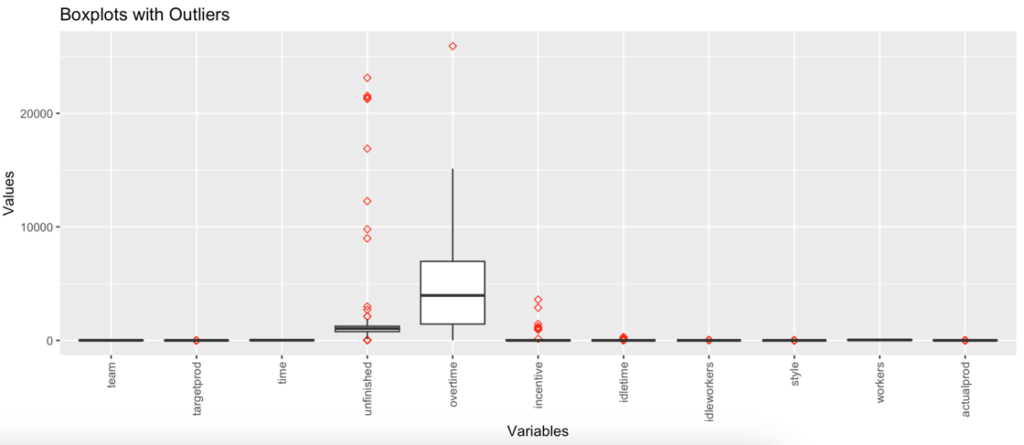
With the help of skim(workerProductivity) Unfinished, overtime, incentive, idletime and idleworkers having a greater differences between 75th percentile and the maximum value which indicates outliers are present in the data.
From box plot (Fig 2)Overtime is comparatively smaller than all others. It means overtime doesn’t contribute much to productivity finding. Worker’s variable is larger than others which shows that no. of workers contribute more to finding out productivity. Also, it’s noted from the box plot is the actual productivity is more than the targeted productivity because the median for actual productivity is higher than the targeted productivity.
# Code to remove space from the attribute department
training_dataset <- within(training_dataset, department[department == 'finishing '] <- 'finishing')
unique(training_dataset['department'])
# Dynamic function which takes an argument as a dataset
# Created dynamic function which takes argument as dataset
create_boxplots <- function(dataSet) {
# Finidng numeric varibales from dataset provided
numeric_columns <- names(Filter(is.numeric, dataSet))
# gather only numeric data
data_numeric <- data %>%
select(numeric_columns) %>%
gather(key = "variable", value = "value", factor_key = TRUE)
# Ploting the box plot with help of ggplot function which takes argument as varibale and it values
ggplot(data_numeric, aes(x = variable, y = value)) +
# Used to prepare box plot with red color oultiers and the shape 5 indicates it
geom_boxplot(outlier.color = "red", outlier.shape = 5) +
theme(axis.text.x = element_text(angle = 90, vjust = 0.5, hjust = 1)) +
labs(title = "Boxplots with Outliers", x = "Variables", y = "Values")
}
create_boxplots(training_dataset)The unfinished column contains a missing value(NA) of around 506. These missing values are handled by setting NaN value as 0. This NaN value indicates that the current observation doesn’t have an unfinished variable value noted.
# Role of missing data
# Checking and printing for each colums with it NaN value count
colSums(is.na(training_dataset))
# Replacing NaN values with 0
training_dataset[is.na(training_dataset)] <- 0
# Distribution of the variables provided
# Plotting the histogram for Overtime, Incentive and Actual Productivity
generate_histograms <- function(training_dataset, xvariable, binWidth, title, label_for_xaxis, label_for_yaxis) {
plot <- ggplot(training_dataset, aes_string(x = xvariable)) +
geom_histogram(binwidth = binWidth) +
labs(title = title, x = label_for_xaxis, y = label_for_yaxis)
return(plot)
}
generate_histograms(training_dataset, "overtime", 500, "Overtime Histogram", "Overtime", "Count")
generate_histograms(training_dataset, "incentive", 100, "Incentive Histogram", "Incentive", "Count")
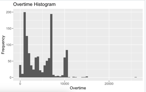
generate_histograms(training_dataset, "actualprod", 0.05, "ActualProd Histogram", "Actual Productivity", "Count")- Overtime: right-skewed distribution, indicating that most data points have low overtime values, with a few observations having high overtime values.
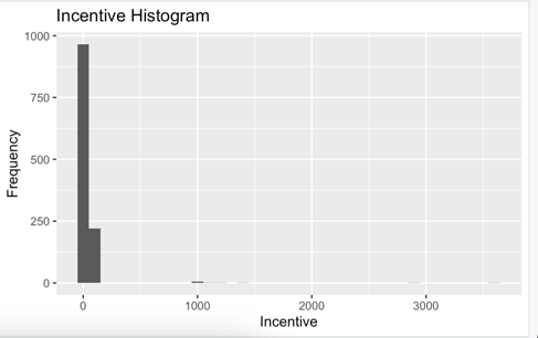
- Incentive: skewed distribution as well, with a majority of the data points having low or no incentives.
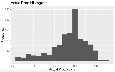
- ActualProd the actual productivity variable could help us understand its distribution, which could be roughly normal or have some degree of skewness.
Relationships between variables
# correlation after the data preprocessing
numericData <- cor(training_dataset %>% select_if(is.numeric))
corrplot(numericData, type = "lower", method = "circle", tl.col = "Black", tl.cex = 0.8)

# Changing the date from char to Date data type
training_dataset$date <- as.Date(training_dataset$date, format = "%m/%d/%Y")
head(training_dataset)

# Two line scatter plot for Actual and Target productivity analysis
# Taking aggregate of Date, target and actual productivity values
dates <- aggregate(training_dataset$targetprod, by=list(training_dataset$date), mean)$Group.1
targetProductivity <- aggregate(training_dataset$targetprod, by=list(training_dataset$date), mean)$x
actualProductivity <- aggregate(training_dataset$actualprod, by=list(training_dataset$date), mean)$x
# Ploating the graph to visualize the actual and target productivity in same graph
plot(dates, targetProductivity, type = "l", ylim = c(min(targetProductivity, actualProductivity), max(targetProductivity, actualProductivity)),
     xlab = "Dates", ylab = "Productivity", col = "blue", main = "Actual & Target Productivity over Time")
lines(dates, actualProductivity, col = "red")
# Adding names to axis to increase readability of graph
legend("topleft", legend = c("Target Productivity", "Actual Productivity"), col = c("blue", "red"), lty = 1, cex = 0.8)
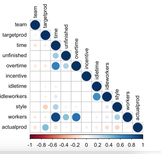
The majority of the relationships between the different attributes show a weak and insignificant correlation. There are only a few instances where moderate to strong positive correlations were observed.
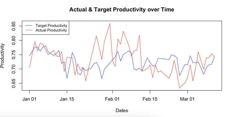
From the correlation matrix (Fig 6) it can be highlighted that the workers – time have an high positive correlation, overtime – time, workers – overtime have moderate positive correlation. Fig 7 shows that there is big difference between around 22nd Jan to around 10th Feb. Also there is a massive drop can be seen from 10th Feb to 6th March in actual productivity but the target productivity is still on moderate level. From the graph we can conclude that the actual productivity is higher than the targeted productivity although it seems to be volatile.
3. Fitting a statistical model to the training data and using it to forecast the actual productivity value for the test dataset.
Which model is good fit comparing with other models
Depending on the analysis goal and the properties of data, The ARIMA model is best fit over the VR – vector regression model. ARIMA is univariant time series model helps to predict future values based on historical data and error values as well. Whenever data is with linear trend or seasonality it is recommended to go with ARIMA model. The Dataset we are using has a single target variable i.e. worker productivity which makes ARIMA a good fit. ARIMA can handle non-stationarity data by differencing which removes trends and seasonal patterns. Comparing with VR model this model is mainly used for multivariant time series forecasting. As the forecasting is dependent on another values from dataset and which is not depends on past values. In this dataset we are forecasting the actual productivity of the worker based on their historical data with time series problem.
# Generating new data frame with newly created 3 variables in prevoius step
training_dataFrame <- data.frame(dates,targetProductivity,actualProductivity)
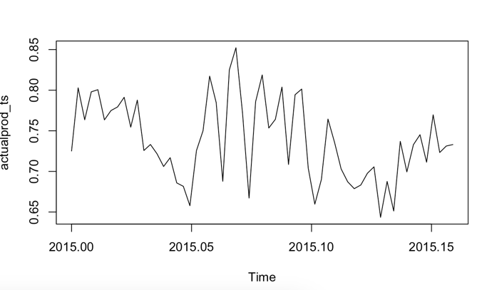
actualprod_ts <- ts(training_dataFrame$actualProductivity, start=c(2015,1), frequency = 365)
plot(actualprod_ts)
arima_model <- auto.arima(actualprod_ts)
summary(arima_model)

# Checking residuals
residuals <- residuals(arima_model)
plot(residuals, main = "Residuals of ARIMA Model")
acf(residuals, main = "ACF of Residuals")

# Ljung-Box test for autocorrelation with residual as parameter
Box.test(residuals, type = "Ljung-Box")

# Data Processing for testing dataset
testing_dataset$date <- as.Date(testing_dataset$date, format = "%m/%d/%Y")
testing_dataset <- within(testing_dataset, department[department == 'finishing '] <- 'finishing')
testing_dataset[is.na(testing_dataset)] <- 0

# Taking aggregate of Date, target and actual productivity values
dates <- aggregate(testing_dataset$targetprod, by=list(testing_dataset$date), mean)$Group.1
targetProductivity <- aggregate(testing_dataset$targetprod, by=list(testing_dataset$date), mean)$x
actualProductivity <- aggregate(testing_dataset$actualprod, by=list(testing_dataset$date), mean)$x

# Generating new data frame with newly created 3 variables
testing_dataFrame <- data.frame(dates, targetProductivity, actualProductivity)

# generating time series object
actualprod_testing_ts <- ts(testing_dataFrame$actualProductivity, start=c(2015,1), frequency = 365)

# Creating forecast with help of ARIMA
arima_forecast <- forecast(arima_model, h = length(actualprod_testing_ts))
# Ploting the graph
plot(arima_forecast)
# Checking accuracy of model
accuracy(arima_forecast, actualprod_testing_ts)
# Checking residuals infomation for forecasted data
checkresiduals(arima_forecast)
Underlying assumptions of the model and residual analysis to ensure that the assumptions are satisfied.
Below are the Assumptions considered for ARIMA:
- Linearity- relationship between dependent variables and its lags is linear.
- Stationarity – The statistical properties of data like means variance does not change over time as time series is stationary.
- Normally distributed errors- error(residual) should follow a normal distribution.
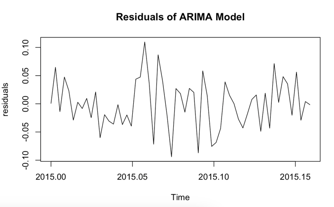
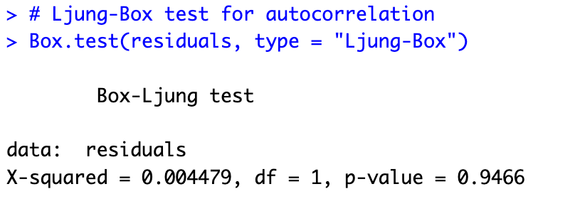
The auto.arima function selected an ARIMA(3,1,0) model, indicating that the best model has 3 autoregressive (AR) terms, 1 level of differencing, and 0 moving average (MA) terms. The AIC, AICc, and BIC values are -191.02, -190.27, and -182.78, respectively. The lower these values, the better the model fits the data. There is no significant autocorrelation in the residuals of the ARIMA model, according to the Ljung-Box test, which produces a p-value of 0.9466, which is higher than the significance level (typically 0.05). This demonstrates that the underlying patterns in the data were accurately modeled by the ARIMA model.
Results by forecasting the actual productivity value for the test dataset
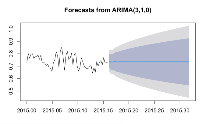
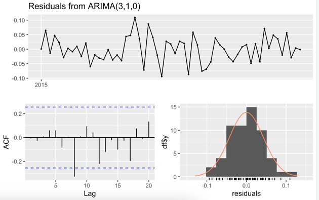
In this case, the Ljung-Box test statistic (Q*) is 13.174 with 9 degrees of freedom (df). The pvalue is 0.1549.A significant level (alpha) with a 0.05 value helps to get that should we accept the Null hypothesis or reject it. There is no autocorrelation in the residual of the Ljung-Box test for the null hypothesis. The forecast for worker productivity appears to be a straight line from the end of the training dataset onwards. This result suggests that the model expects productivity to remain relatively constant, without any significant changes or trends in the future.
Weaknesses of this analysis :
- The analysis assumes that the data has a yearly pattern because it uses a frequency of 365, which represents daily data with annual cycles. If the dataset has different patterns, like weekly or monthly cycles, the model may not effectively capture these variations, leading to less accurate predictions.
- The current approach doesn’t consider any external factors or variables that could impact worker productivity. If there are other influential factors, using a more comprehensive model, such as Vector Autoregression (VAR) or a regression model combined with ARIMA errors, might be a better choice to accurately predict productivity.
- The ARIMA model used in this analysis requires that the time series data be stationary or can be made so through differencing. If the actual data doesn’t meet these requirements and cannot be transformed, the model’s performance might be negatively affected.